 Facebook
 X
X
 Pinterest
 Copy Link
In Quarter 2 of 2014, Low Interest Rates Helped Keep Mortgages Affordable, Even as Rents Remained Widely Unaffordable
Posted by: Meredith Miller, Zillow
-
Purchasing a home is more affordable today than it was historically in 94 of the country’s 100 largest metro areas.
-
But renting a home is less affordable today than it was historically in 88 of the country’s 100 largest markets.
-
Affordability remains an issue in many California markets, where both rental and for-sale affordability are worse than they used to be.
Americans are always in search of affordable housing. But whether you’re looking to buy or rent, finding housing that is as affordable today as it has been in the past can be relatively easy in some areas and impossible in others, according to the Zillow Affordability Index.
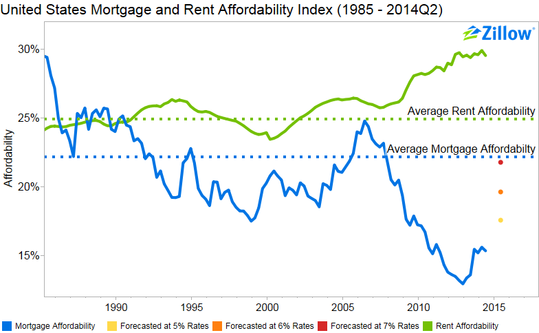
In many areas, as long as you have saved for a 20 percent down payment, monthly payments on a mortgage for a typical home consume a smaller portion of a median household’s income than they did in the years leading up to the housing bubble. The share of income devoted to rent, on the other hand, is well above historic norms in most places.
In the second quarter of 2014, the typical U.S. household earning the national median income and purchasing a home would need to devote slightly more than 15 percent of their income to the mortgage payment (principle and interest, and assuming a 20 percent down payment) on a median-valued home. Between 1985 and 2000, the years prior to the start of last decade’s housing bubble, the average share of income devoted to mortgages was 22 percent. Nationally, it is very affordable to purchase a home.
But renters earning the national median income who signed a lease in the second quarter needed to spend 30 percent of their income on a rent payment, 5 percentage points higher than the 1985-2000 average of 25 percent. In other words, it is currently very unaffordable to rent a home.
The 2014 Q2 Affordability Index is calculated nationally and for 289 metro areas. In 277 out of the 289 metro areas covered, the percent of income devoted to mortgage payments remains below historic averages. Those areas where the difference between income currently devoted to mortgage payments and the share of income historically devoted to mortgage payments is largest include: Los Angeles (43 percent currently, compared to 35 percent historically); Santa Cruz, California (45 percent compared to 38 percent) and Santa Rosa, California (38 percent compared to 33 percent).
It should be noted that in most areas, one of the primary reasons for very low mortgage payments now compared to historic norms is because mortgage interest rates are so low. As rates rise, financing a home will become more expensive and will consume a larger share of income than currently. This is particularly worrisome in areas where the share of income needed to purchase a home is already above historic norms, as that share will only grow as rates rise.
The 2014 Q2 Rent Affordability Index covers 276 metro areas. In 222 of the 276 metro areas covered by the index, rent affordability is currently worse than the area’s historic average. Generally, a rule of thumb is that rent should not exceed 30 percent of income. But in 99 of the areas analyzed, renters should expect to pay 30 percent or more of their income to their landlord. Large areas with the most unaffordable rents include Los Angeles (48 percent of income), Miami (44 percent of income) and San Francisco (44 percent of income).
What makes the rent “too damn high”?
Since the year 2000, rents have grown 59 percent[i], yet median household income has only grown 26 percent. This discrepancy in growth rates has led rentals to become less affordable, moving the rent affordability index above average (meaning rents require a higher percentage of income) by the first quarter of 2003. Beginning in 2000, home values grew faster than historic rates, peaking in 2007, before declining rapidly from 2007 until early 2012. Because rents did not reset during the crisis, as home values did, rents continued to be more expensive compared to buying a home.
The following figure shows a scatterplot of mortgage versus rent affordability, with the color scale set as the metro area’s price to income ratio and a black 45 degree reference line showing where mortgage and rents represent equal shares of income. In 2000, the housing bubble hadn’t begun in full force, and metro areas were fairly evenly split between having mortgages (above the black line) or rent (below the black line) requiring a higher percentage of income. Throughout the three graphs, we see the same group of California metro areas at the top of the scale with respect to mortgage affordability, although their price to income ratios and mortgage affordability move over time, depending on the relationship between incomes, home values and mortgage rates.
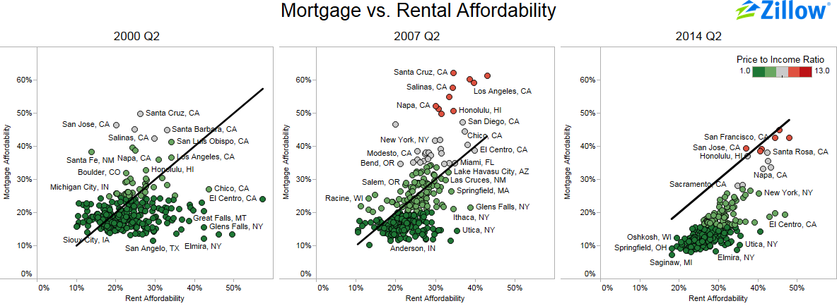
In 2007 Q2, at the height of the housing bubble, metro areas remained split between mortgages requiring a greater percentage of income (above the black line) and rents requiring a higher percentage income (below the black line). The key differences between the 2000 and 2007 plots are that, compared to 2000 Q2, mortgages became less affordable in many areas. The price-to-income ratio in some metros was also very high, represented by the red color on the dots.
Comparing 2007 Q2 to 2014 Q2, we see a shift in the overall pattern of the dots in the scatterplot. All but one of the metro areas (San Jose) have shifted to the right of the reference line, signifying that rent affordability is higher (more expensive) than mortgage affordability. This trend is attributable to the fact that rents continued to increase even as home prices fell, and because income growth during this period was below average. Interestingly, the mortgage affordability index declined from 2007 Q2 to 2014 Q2, while price-to-income ratios remained in the same ranges (red). This shift in affordability is because of the historically low, yet slowly rising, interest rate environment experienced after home values bottomed.
Methodology
To calculate mortgage affordability, we first calculate the mortgage payment for the median-valued home in a metropolitan area by using the metro-level Zillow Home Value Index for a given quarter and the 30-year fixed mortgage rate during that time period, provided by the Freddie Mac Primary Mortgage Market Survey (based on a 20 percent down payment). Then, we consider what portion of the monthly median household income goes toward this monthly mortgage payment. Median household income is currently available through 2012. For years following 2012, we calculated the median household income by estimating it using the Bureau of Labor Statistics’ Employment Cost Index.
The affordability forecast is calculated similarly to the current affordability index but uses the one year Zillow Home Value Forecast instead of the current Zillow Home Value Index and a specified interest rate in lieu of PMMS. It also assumes a 20 percent down payment.
We calculate rent affordability similarly to mortgage affordability; however we use the Zillow Rent Index, which tracks the monthly median rent in particular geographical regions, to capture rental prices.
